
packaging
Wine Label Redesign
the challenge:
Complete Redesign -A full departure from the existing look. We are looking for something bold and disruptive on shelf.
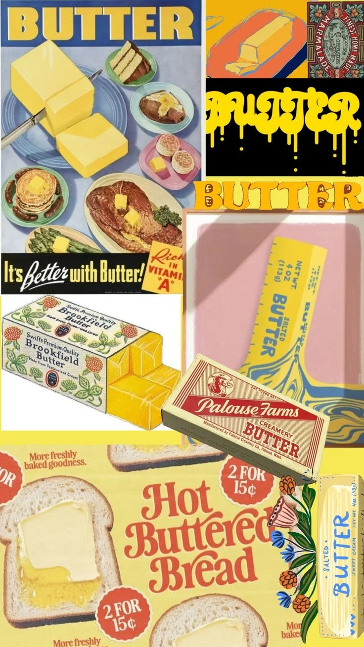
Inspo: Melted butter, vintage packaging, light and bright.
Software Used: Adobe Illustrator, Adobe Photoshop, Adobe Indesign
final concepts
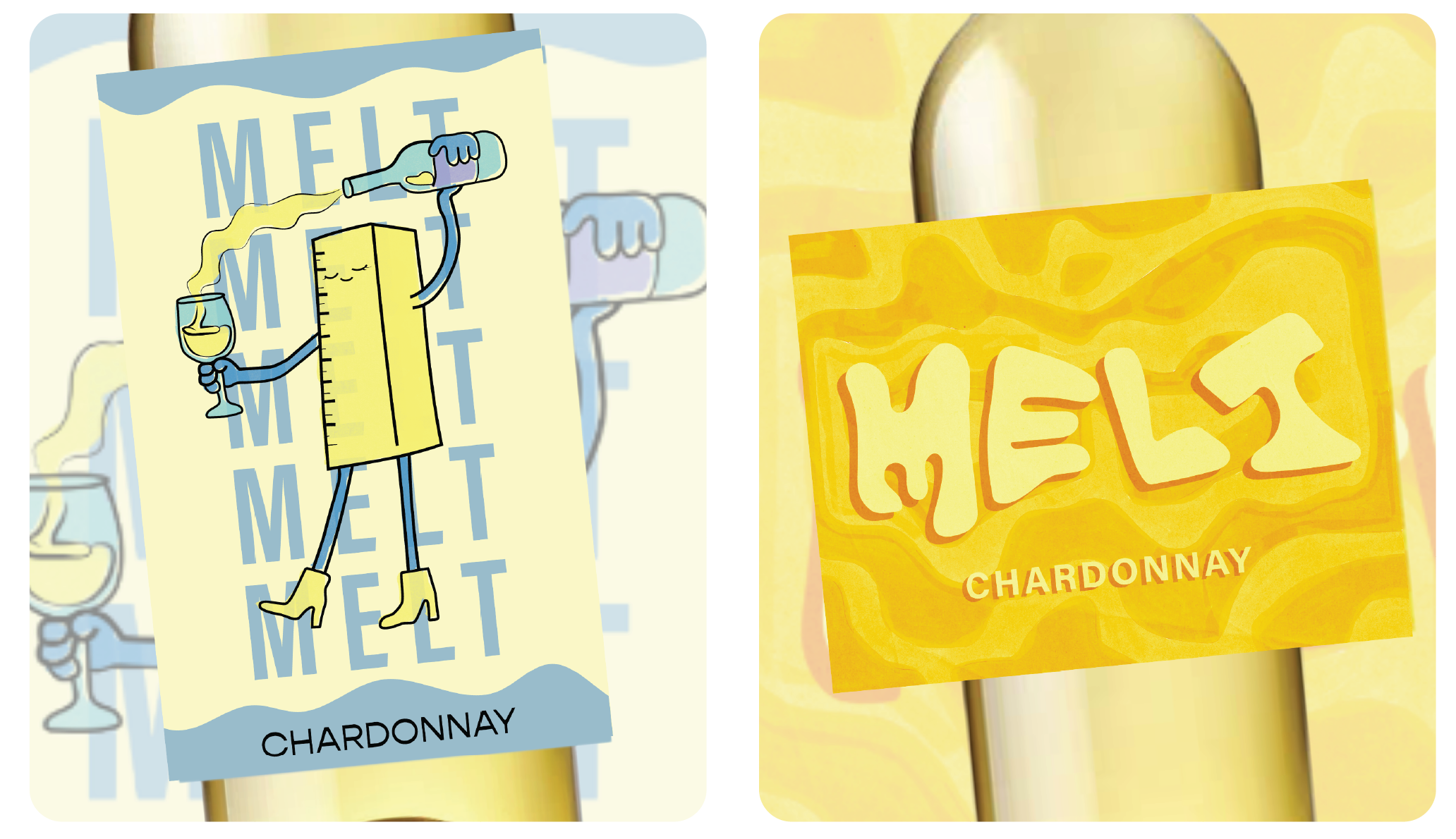
This wine label redesign was designed as a bold departure from the brand’s existing visual identity, aiming to be playful, distinctive, and eye-catching on the shelf. Using the client’s mood board as a starting point, I translated references to melted butter, vintage packaging, and bright, nostalgic color into a cohesive label system for a Chardonnay. The final direction combines warm, buttery tones with hand-drawn typography, organic shapes, and a playful illustration to give the wine a memorable personality while maintaining clear product communication. The project allowed me to explore how illustration, typography, color, and texture can work together to create packaging that feels both unexpected and approachable.
Wine Label Redesign
the challenge:
Complete Redesign - a full departure from the existing look, paired with a shift in brand strategy or target consumer.
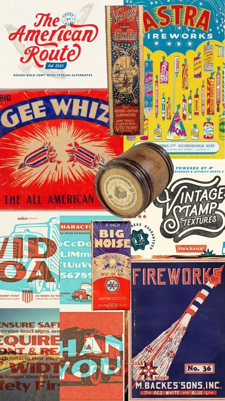
Inspo: America's 250th Birthday. Fireworks. vintage 4th of july.
Software Used: Adobe Illustrator, Adobe Photoshop, Adobe InDesign
final concepts
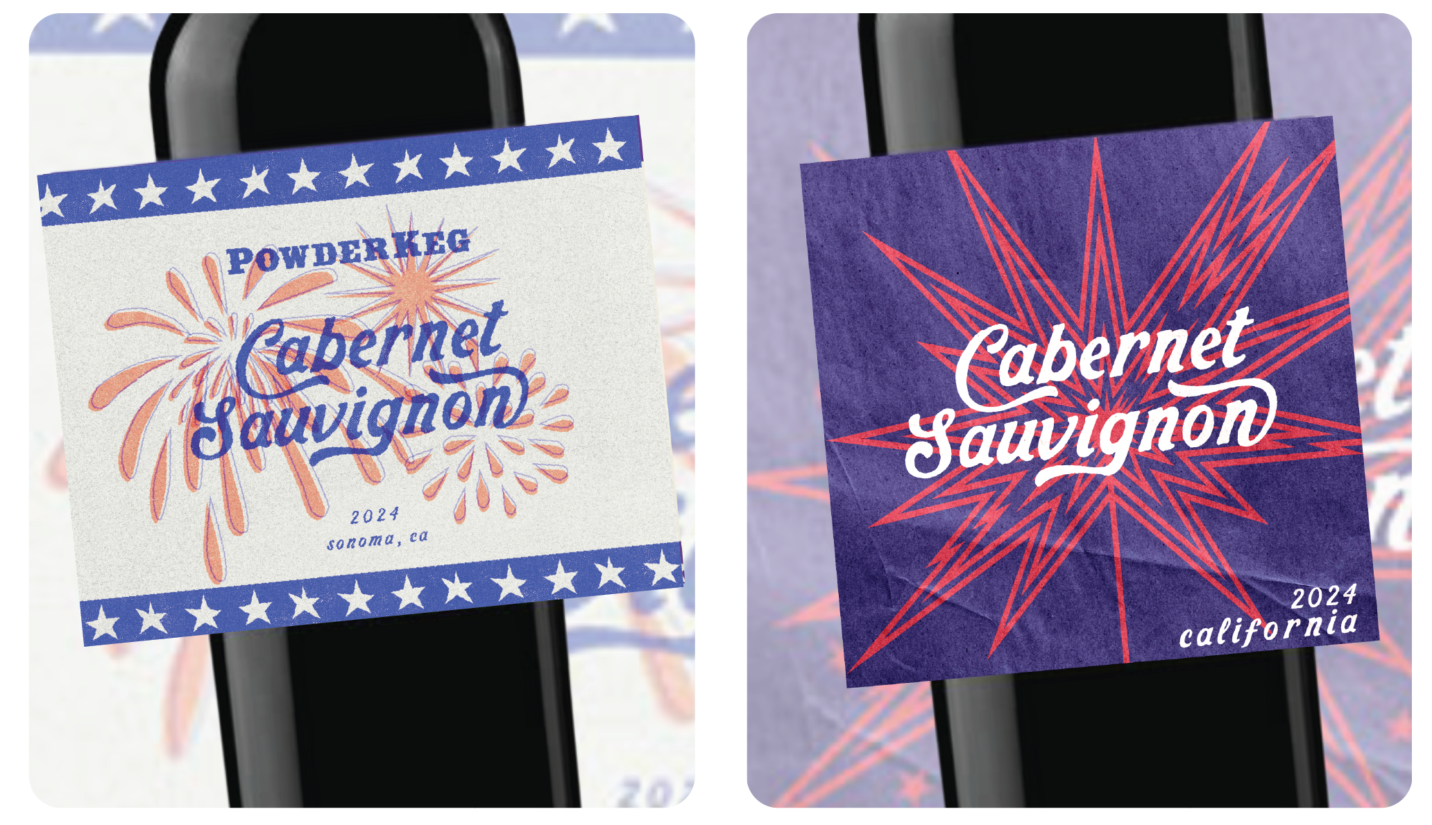
The final concepts pair expressive hand-lettering with energetic graphic elements, giving the Cabernet Sauvignon a sense of character and confidence. The result is a label designed to stand out on the shelf while feeling like a modern take on classic California wine culture.
Wine Label Redesign
the challenge:
A Major Refresh – a bold evolution of the label, signaling a new chapter for the brand while maintaining some recognizable elements(Brand Name/logo).
Software Used: Adobe Illustrator, Adobe Photoshop, Adobe InDesign
final concepts
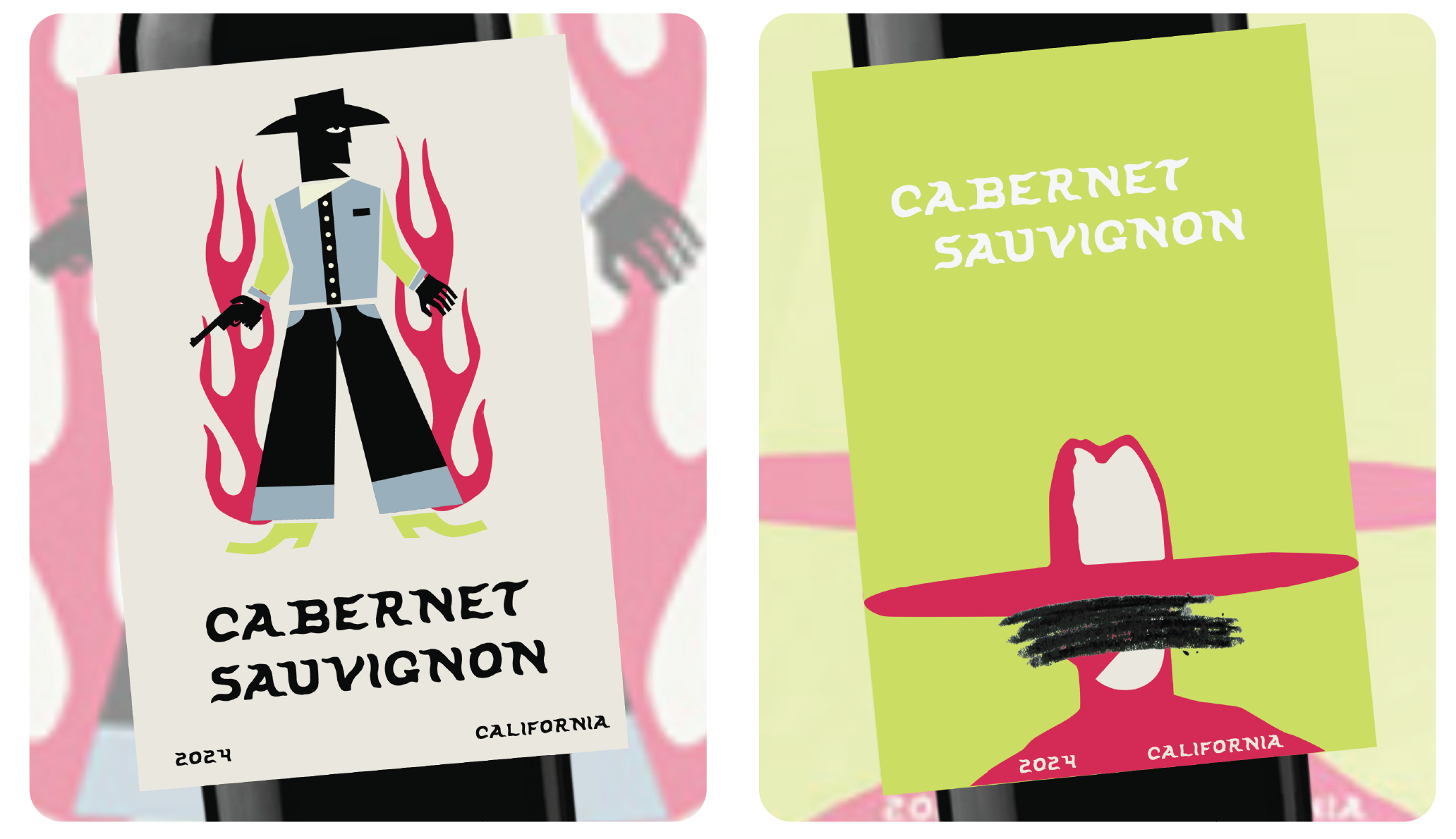
With no specific creative direction from the brand, I had the opportunity to build a visual concept around the name Powder Keg itself. I leaned into its Western and firearm-inspired associations, using a stylized cowboy character, flame and gun motifs, bold colors, and expressive hand-drawn typography to give the Cabernet Sauvignon a distinct personality. The playful illustrations keep the concept from feeling overly serious, while the unexpected color combinations help the labels stand out in a crowded wine market. I also explored multiple colorways to show how the visual system could expand across the brand. The result is a bold, memorable identity that turns an open-ended brief into a cohesive visual story.
If you're interested in working with HK Creative Co, complete the form with a few details about your project. We'll review your message and get back to you within 48 hours.